My UX Portfolio, Reimagined
This case study explores the full redesign and development of my personal UX design portfolio. The goal was to create a more thoughtful, responsive, and visually engaging site that highlights my skills while offering an intuitive experience across all devices. The process involved user research, responsive UI/UX design, and front-end development resulting in a portfolio that reflects both my design thinking and technical execution.
Timeline
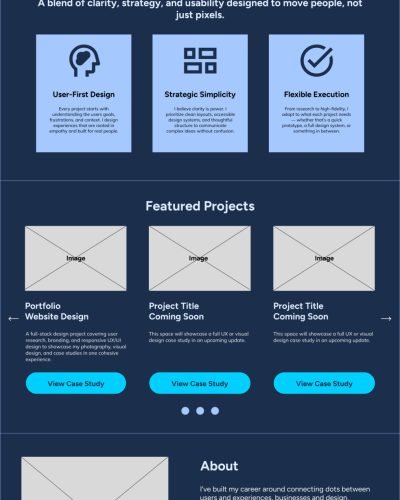
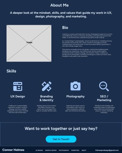
Crafting user-centered digital experiences rooted in research, strategy, and clean usability designed to move users smoothly from first click to final action.
Role
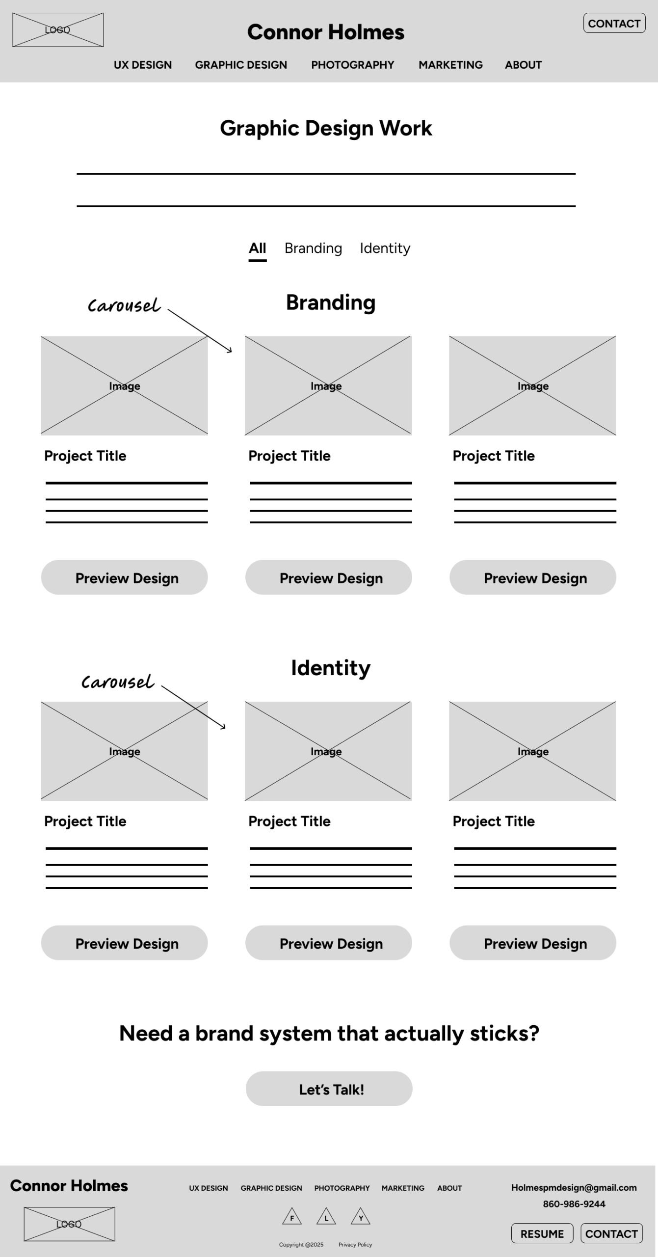
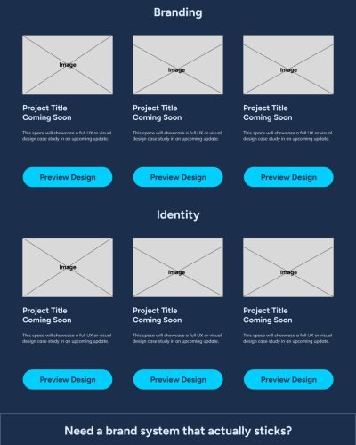
Building strong visual systems that define a brand’s voice, values, and visual impact from logos to complete identity suites.
Tools
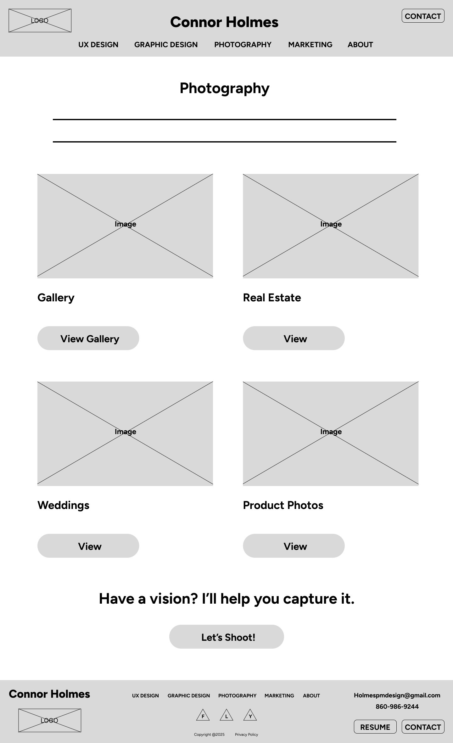
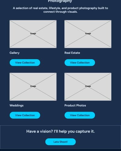
Capturing real stories, spaces, and products with a focus on clean composition, authentic light, and intentional storytelling.
Deliverables
Blending smart strategy with compelling content to help brands grow online from technical SEO setups to creative marketing campaigns.
Overview
Problem
Designers often struggle with balancing creativity and clarity in their portfolios. Too many sites prioritize flashy visuals over clear storytelling, or clutter the user experience with unnecessary complexity. I needed a way to showcase a wide range of work UX, branding, and photography without overwhelming users or losing focus on usability.
Goals
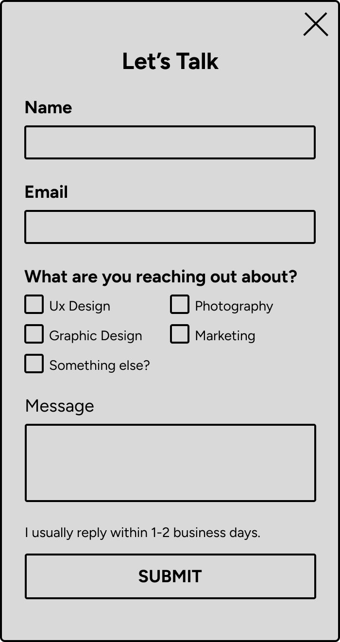
Build a portfolio site that was clean, structured, and user-friendly one that clearly communicates my skills, shows depth of thinking, and allows easy navigation across different types of work. It also needed to work seamlessly across desktop and mobile devices, with strong attention to hierarchy and accessibility.
Research
Define
Ideate
Prototype
Outcome
Process
Research
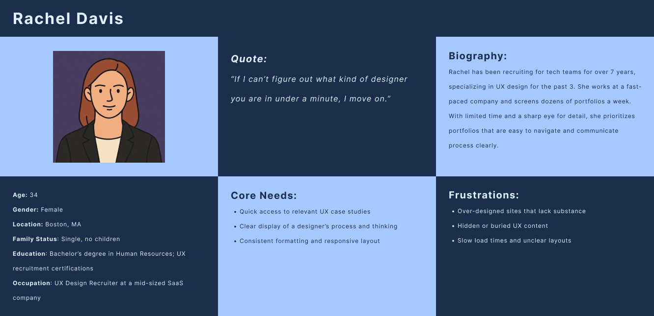
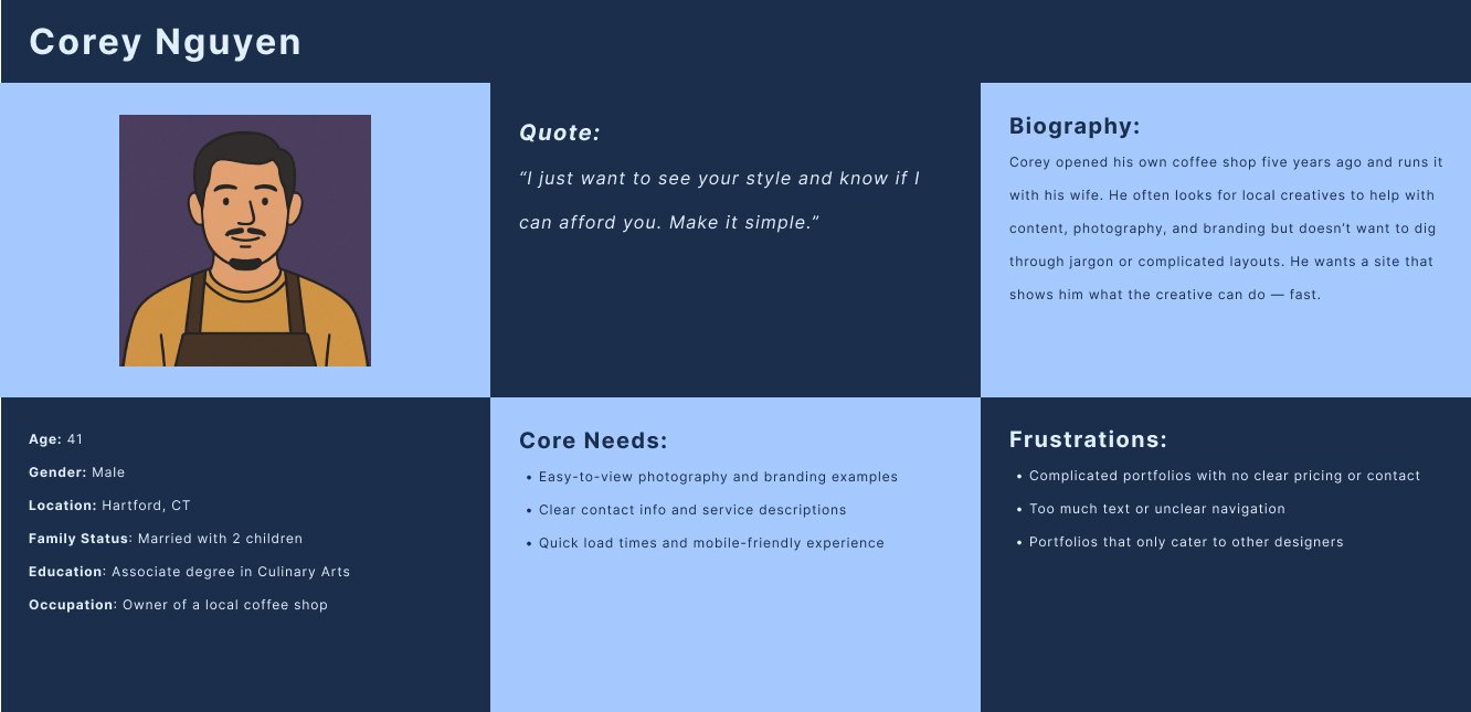
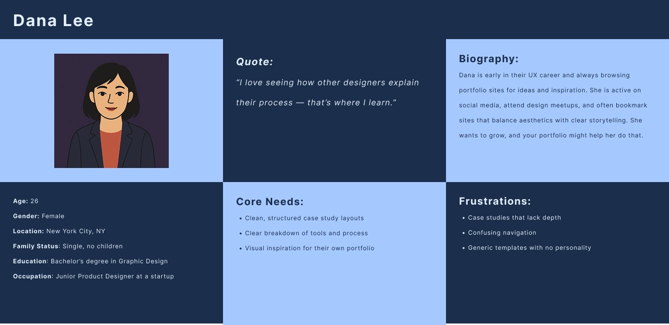
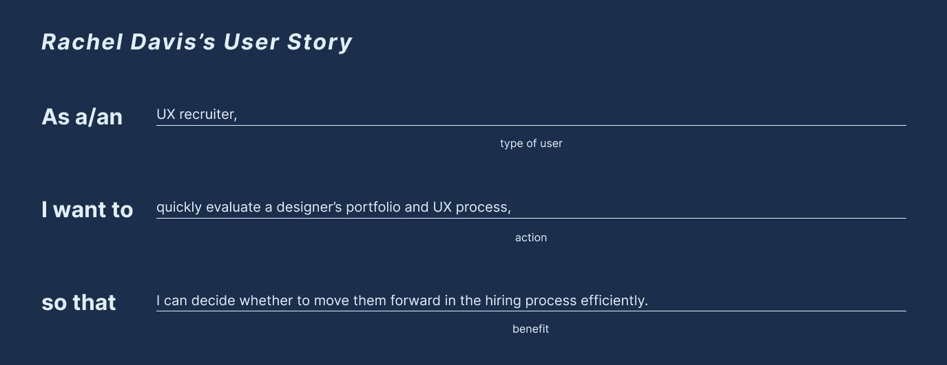
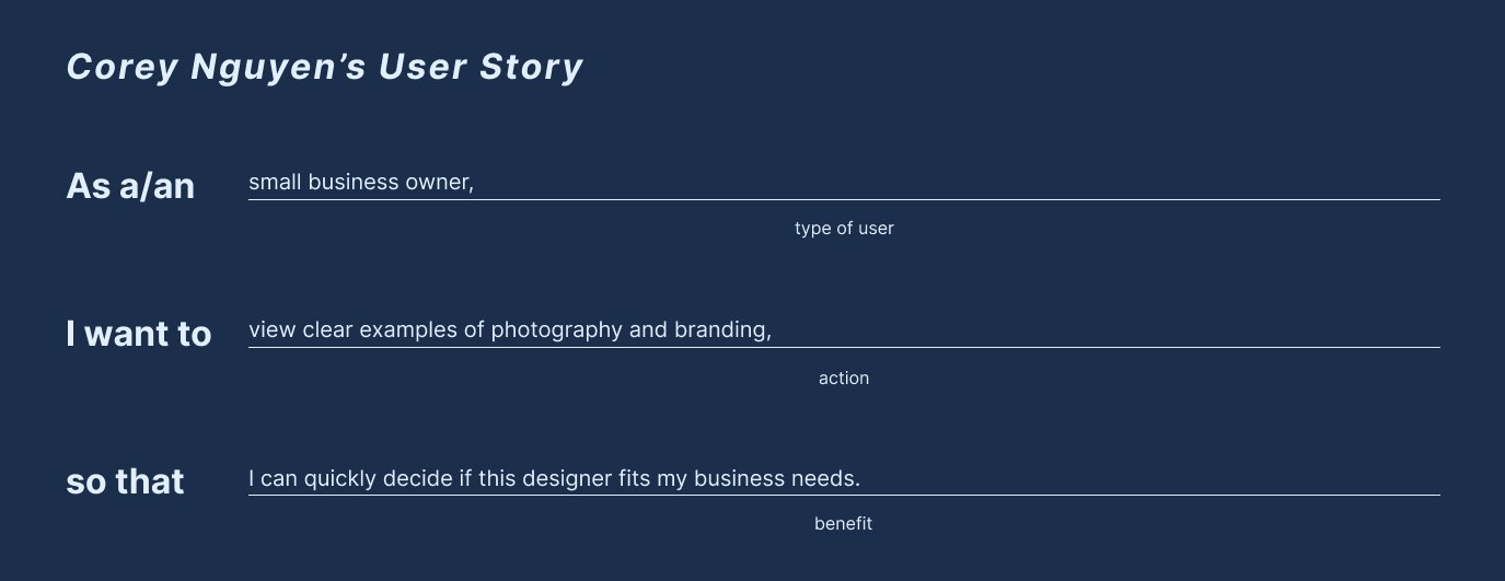
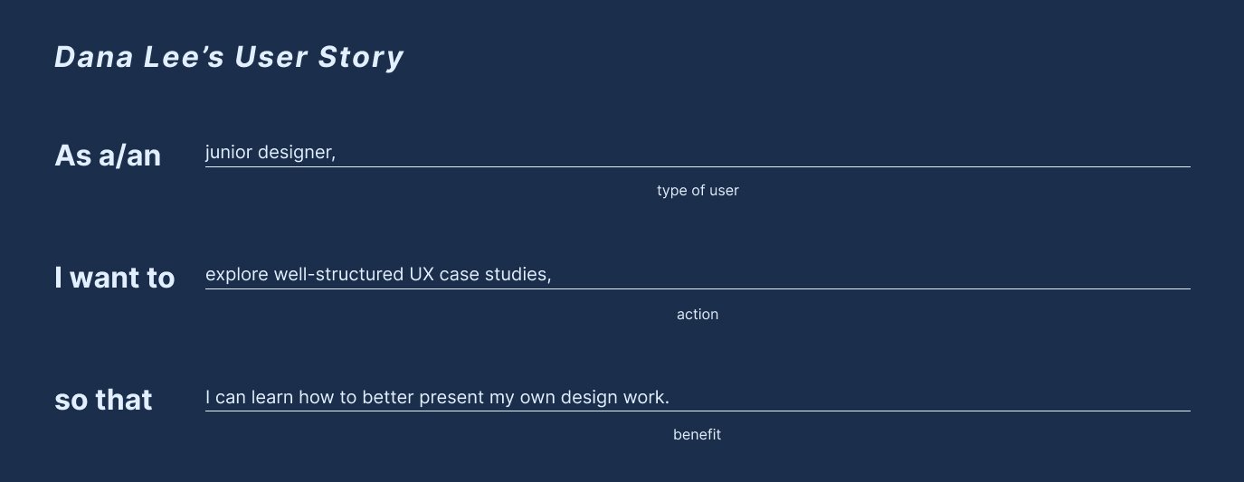
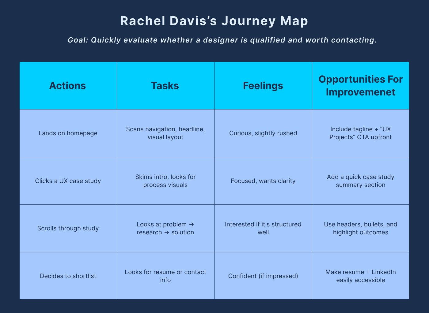
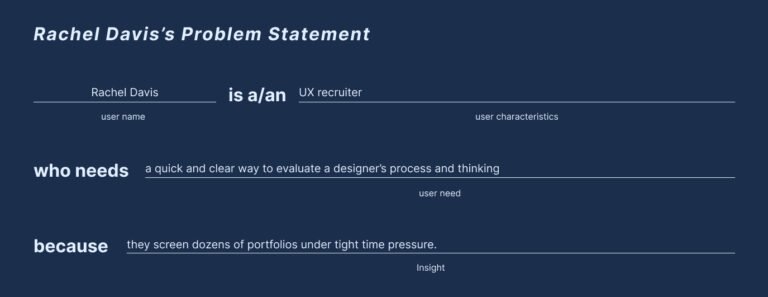
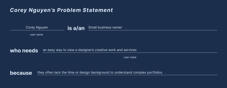
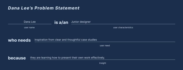
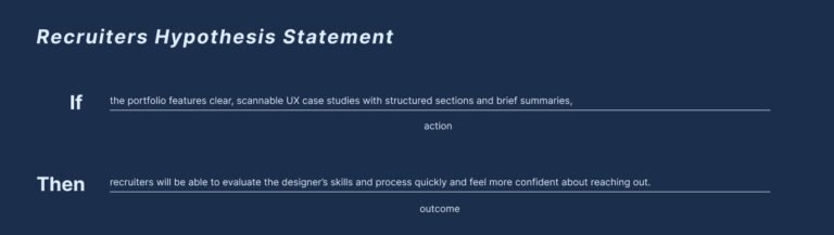
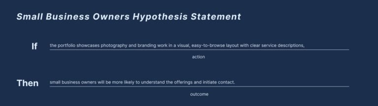
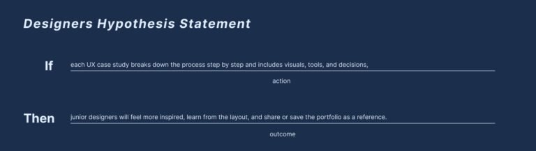
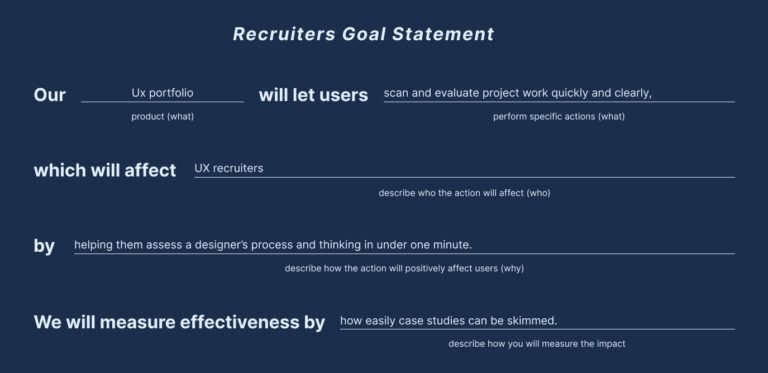
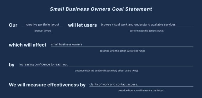
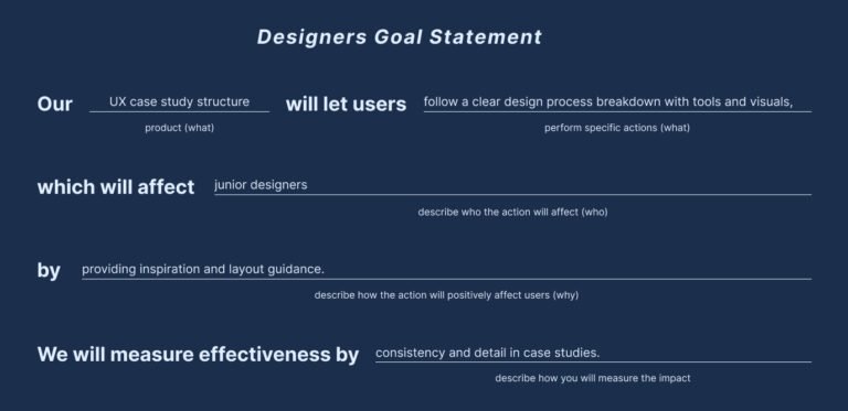
I started by studying UX portfolio best practices to understand what hiring managers and clients look for when reviewing a designer’s work. I reviewed top portfolio sites to find patterns around structure, project storytelling, and visual clarity. From there, I built user personas based on likely visitors including recruiters, creative directors, and potential clients to better empathize with their needs. The main insight: people want a fast, intuitive path to assess a designer’s skills without digging through unnecessary visuals or confusing layouts.
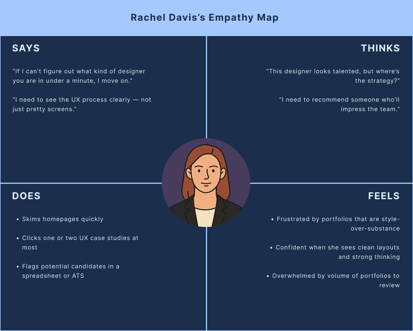
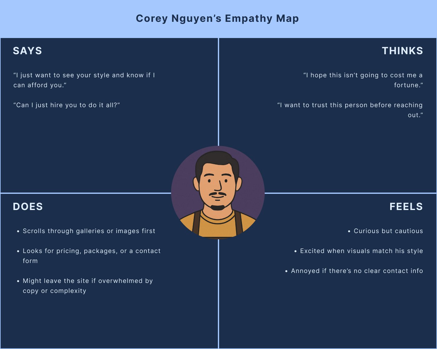
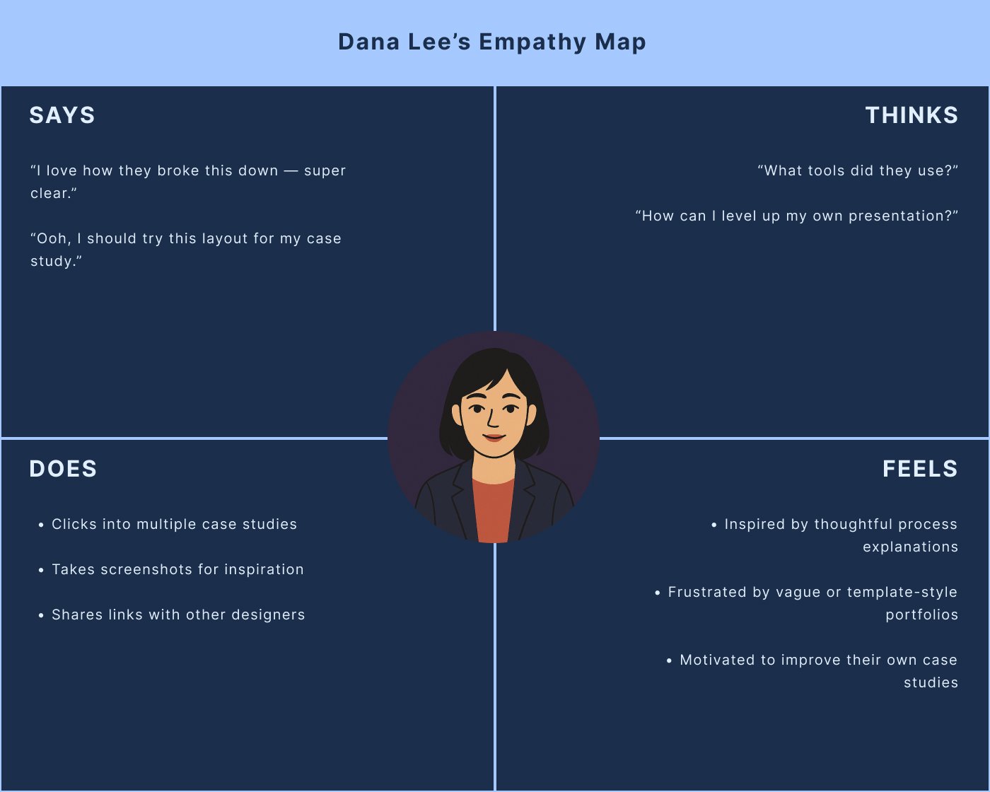
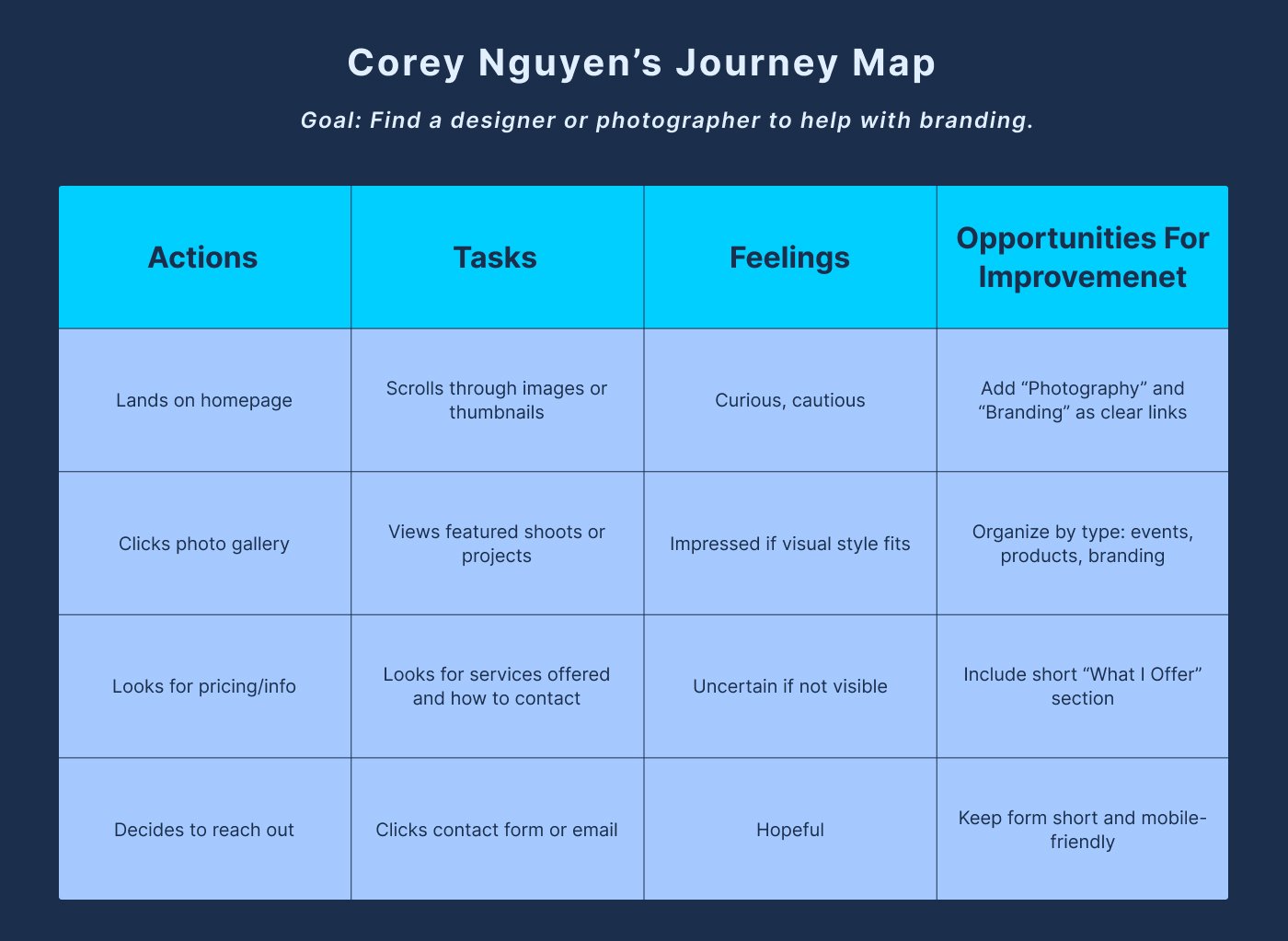
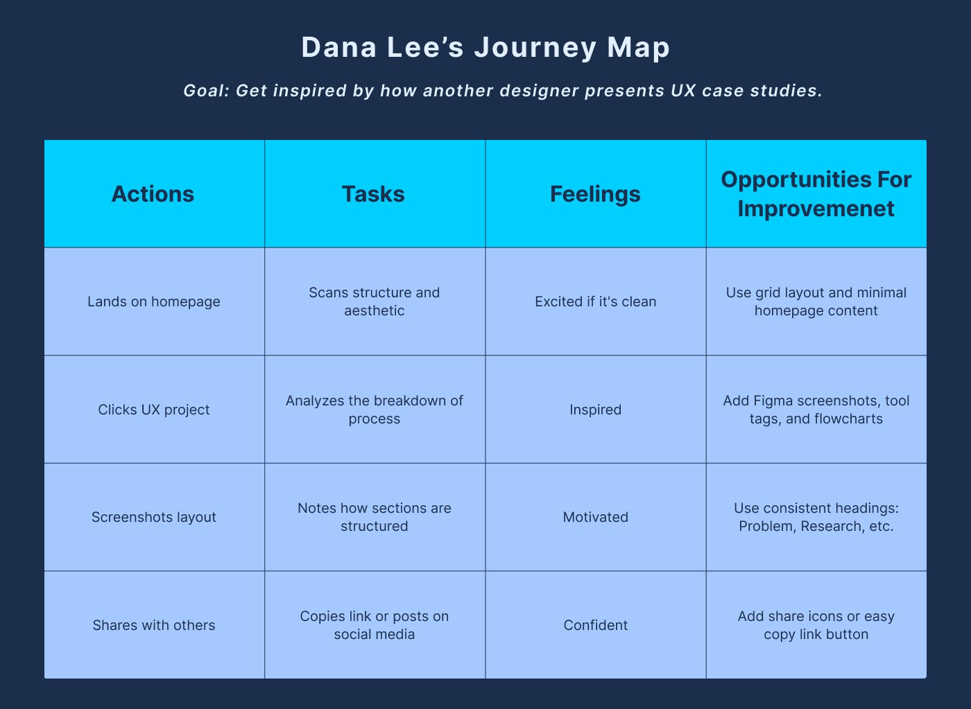
Define
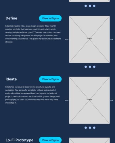
I distilled insights into a clear design problem: “How might I create a portfolio that balances creativity with clarity while serving multiple audience types?” The main pain points centered around confusing navigation, unclear project summaries, and overwhelming visual noise. This guided my structure and content strategy.
Ideate
I sketched out several ideas for site structure, layouts, and navigation flow aiming for simplicity without losing depth. I explored multiple homepage ideas, card layouts for featured projects, and quick-access sections for UX, graphic design, and photography, so users could immediately find what they were interested in.
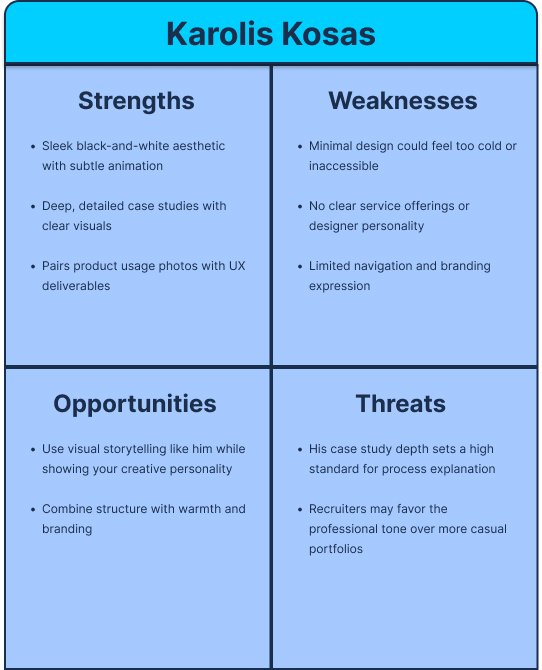
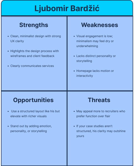
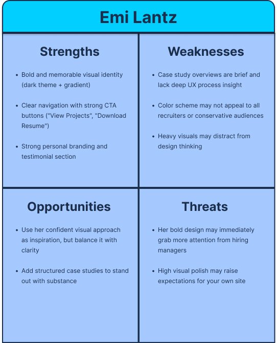
To back up my design direction, I audited three strong UX portfolios: Emi Lantz, Ljubomir Bardžić, and Karolis Kosas. Each had solid case study structure, distinct branding, and clean responsive layouts, but also weak points like missing service clarity or over-reliance on minimalism. Most lacked a hybrid approach that blends UX and creative work or offers distinct paths for different user types. That gap shaped my approach: structured storytelling, visual hierarchy, and a layout that works for clients, recruiters, and peers alike.
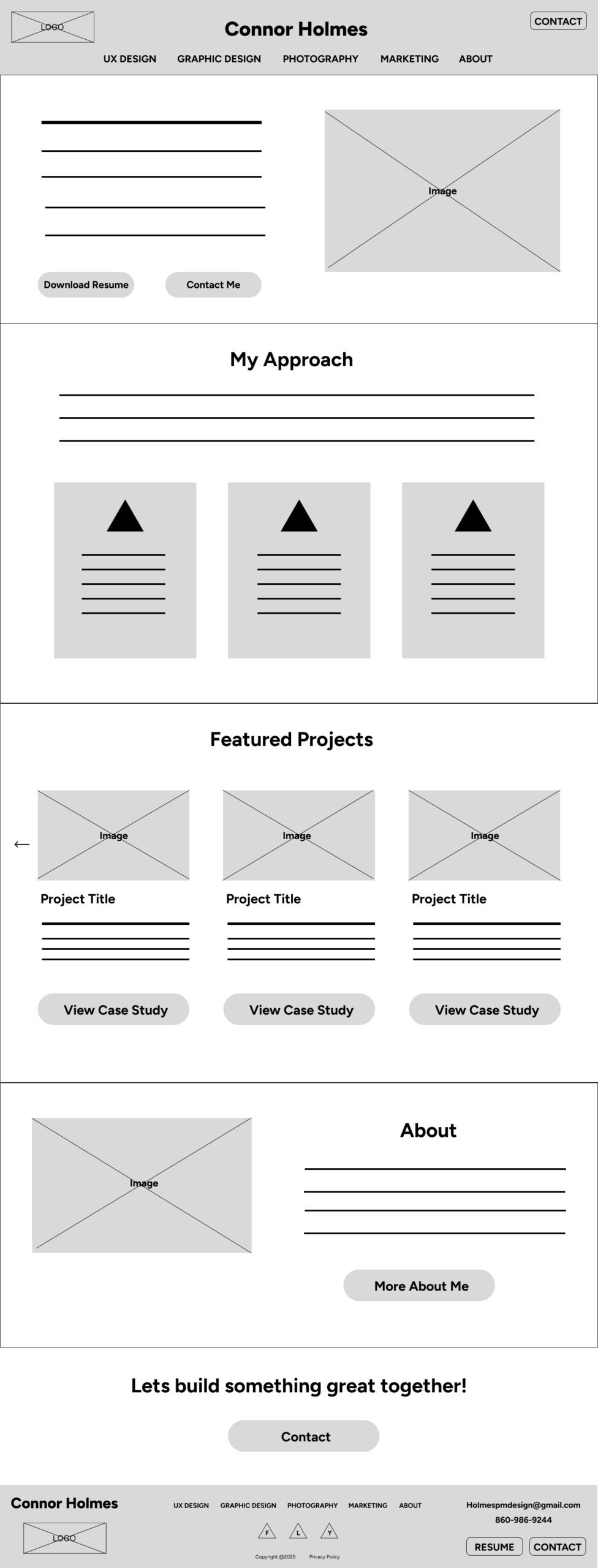
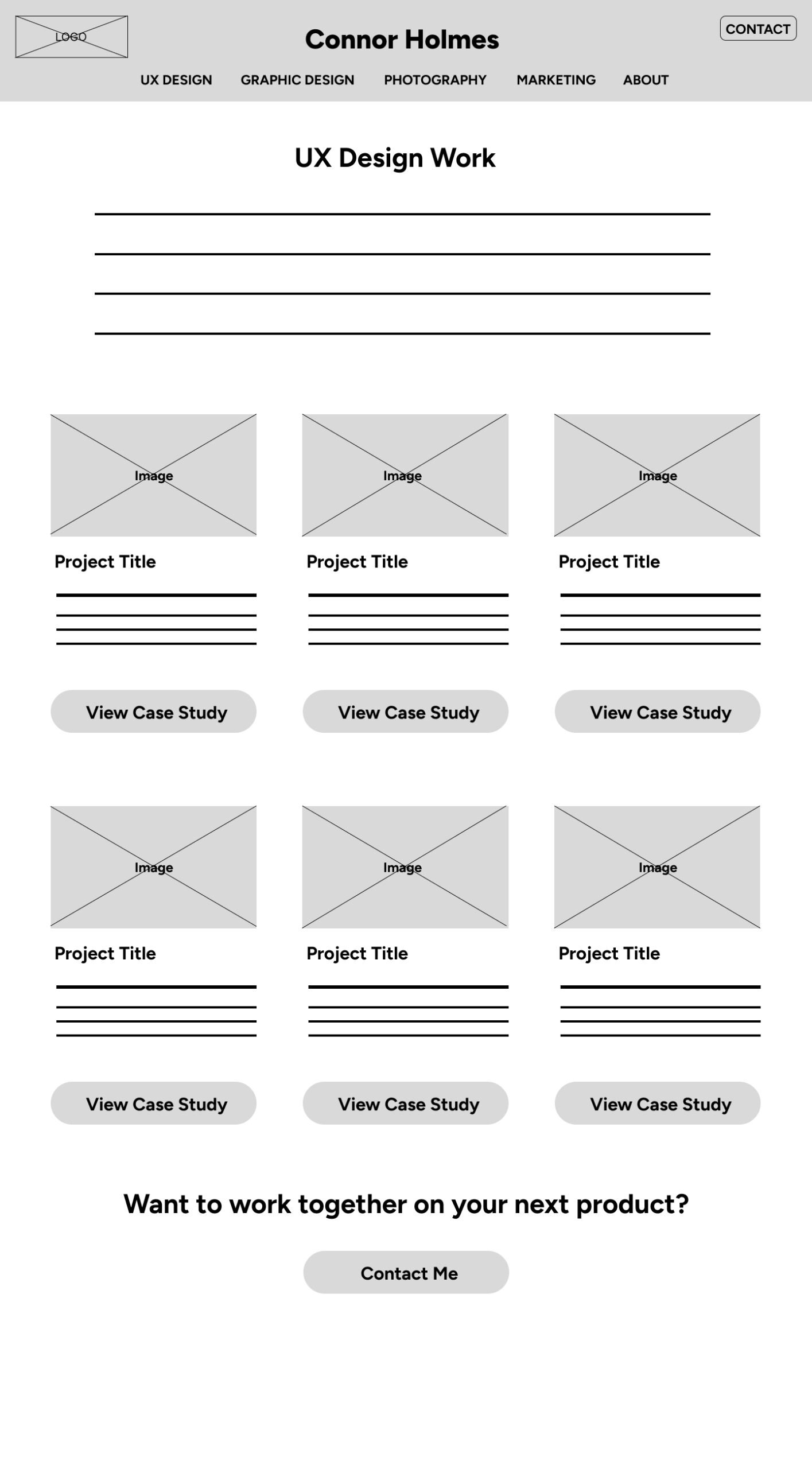
Lo-Fi Protoype
I built wireframes to focus on layout, information hierarchy, and interaction patterns without getting distracted by visuals. Using a 12-column grid, I structured pages for flexibility and responsive behavior. Wireframes allowed me to test early navigation and content prioritization ideas.
Hi-Fi Prototype
In the high-fidelity phase, I applied the final color palette, typography system, and imagery. I created hover states, responsive behaviors, and polished micro interactions to add life to the experience while maintaining clarity. Every visual decision reinforced usability and brand consistency.
Outcome
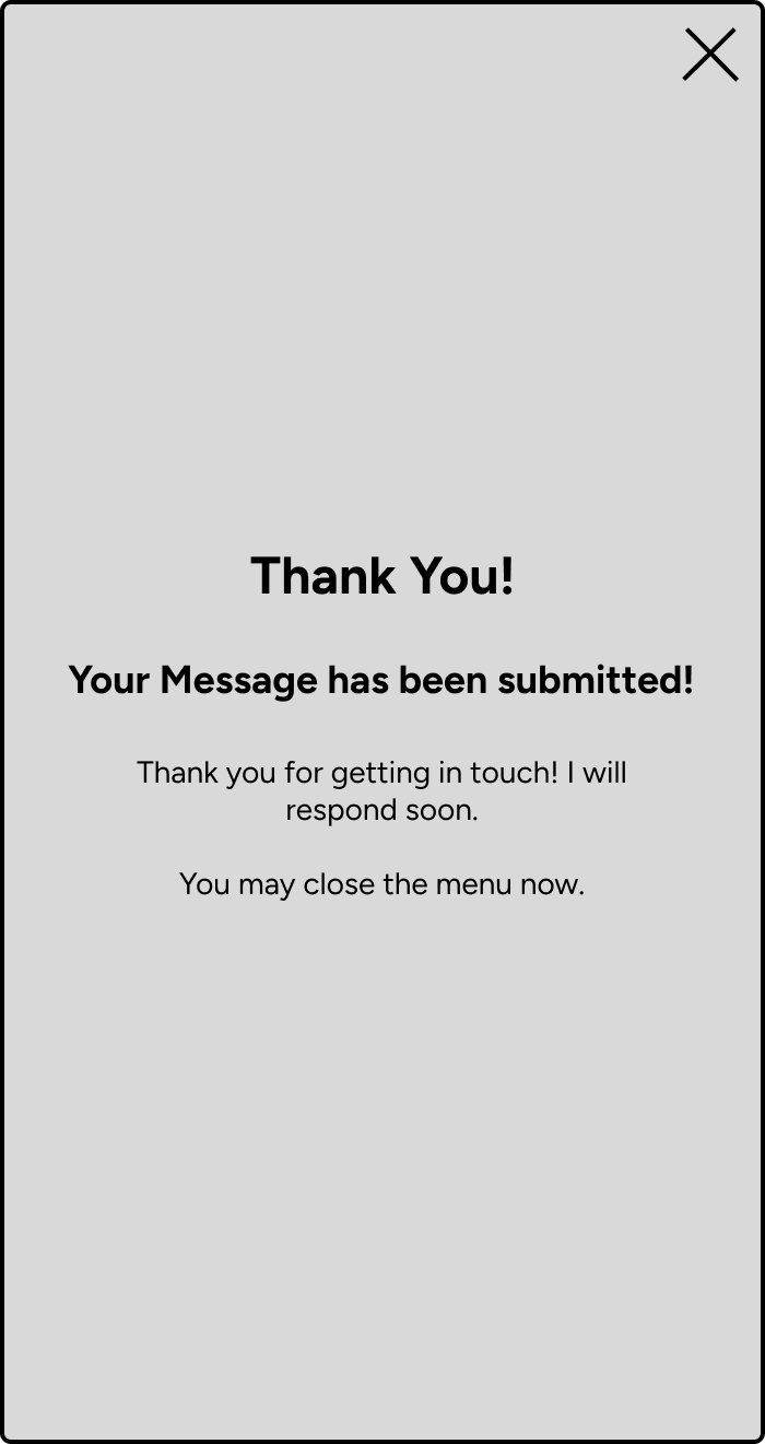
The finished portfolio is a fully responsive site optimized for desktop, tablet, and mobile users. Each screen size was carefully designed and tested to ensure consistency, clarity, and smooth interaction. During development, I invited friends to test the site across devices. Their feedback revealed several functional issues such as buttons not working correctly on mobile that I was able to resolve before launch. These insights pushed me to adapt my design based not only on visuals but on real user behavior.
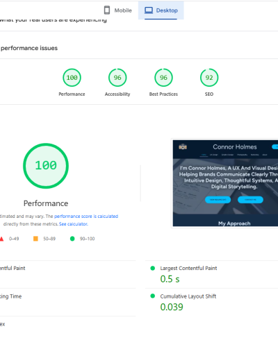
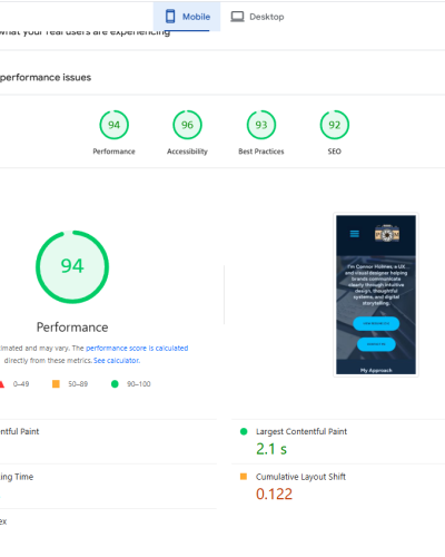
A major focus of this project was performance. I optimized the site’s structure, media, and styling to ensure fast load times and high accessibility. As a result, my site now scores in the green across both mobile and desktop in Google PageSpeed Insights, reflecting strong technical performance in addition to solid UX.
This project reinforced the importance of designing with the user not just the designer in mind. By listening, testing, and iterating, I created a site that’s not only visually polished but functionally strong and user-focused.